Charts & Result Analysis
In this tutorial, we explore how to create, navigate, customize, compare, export, and analyze charts in SIMBA. Start from an example project with simulation results available in the Results panel so you can follow the workflow exactly as it appears in the interface.
Step 1 — Create your first chart from the Results panel
Charts start in the Results panel. When you check a signal, SIMBA automatically creates a chart and displays that waveform.
- Open the Results section in the left sidebar.
- Expand a simulation job to reveal its signals.
- Check one signal to create the first chart automatically.
Legend: A signal is checked in the Results panel. As soon as the checkbox is enabled, SIMBA creates and opens a chart for that waveform.
Step 2 — Learn the chart navigation basics
Hover near the bottom of the chart to reveal the chart toolbar. This is where the main navigation tools are located.
- Use H for Horizontal Zoom
- Use V for Vertical Zoom
- Use A for Area Zoom
- Turn zoom tools off to pan again
- Press Space for Auto Scale
- Press Escape to hide the chart menu
- Drag with the left mouse button to pan
- Use the mouse wheel or trackpad gesture to zoom in or out
Legend: The bottom chart menu appears as the pointer moves near the chart. The video highlights the navigation controls and shows that Escape can be used to hide the menu again.
Step 3 — Use zoom history
Charts keep a history of recent zoom and pan states. This makes it easy to explore a waveform and then step backward or forward through your view changes.
- Use Previous to return to an earlier zoom or pan state
- Use Next to move forward again
Legend: The chart uses the Previous and Next history buttons to step backward and forward through recent zoom and pan states.
Step 4 — Understand charts, plots, and signals
One chart can contain several plots, and each plot can contain one or more signals. This structure is useful when you want to compare related waveforms while keeping their axes organized.
- Use New Chart in the Charts section toolbar to create another chart
- Right-click a chart to Add Plot, Rename Chart, or Delete Chart
- Right-click a plot to Add Plot or Delete Plot
- Drag and drop signals between plots and charts to reorganize the display
Legend: One chart is organized into plots and signals. The video shows how plots are added and how signals can be reorganized inside the chart structure.
Step 5 — Customize the chart, plot, and signal settings
Customization happens at different levels depending on what you select.
The following short videos show four common customization tasks in the Property Grid.
Legend: The selected chart is renamed by editing the chart title in the Property Grid.
Legend: The Single Horizontal Axis option is toggled at the chart level to control whether plots share the same horizontal axis.
Legend: A plot switches its Axis Configuration, showing how signals can be separated onto left and right axes when needed.
Legend: A signal is customized in the Property Grid by changing its visual appearance for easier identification in the chart.
Step 6 — Use Auto-Reload
The newest result is marked Auto-Reload in the Results tree. When you run the simulation again, charts using matching signals from that result update automatically to the latest data.
Legend: The newest result is marked Auto-Reload, and the chart updates automatically when a matching simulation is run again.
Step 7 — Compare runs
Auto-Reload is useful for iteration, but charts are also effective for comparing several runs side by side.
- Give each job a meaningful description.
- Add signals from multiple jobs to the same plot.
- Enable Append Job Description to Signal Labels so the legend clearly identifies each waveform.
Legend: Signals from different runs are displayed together, and Append Job Description to Signal Labels makes the legend clearly identify which waveform belongs to each run.
Step 8 — Measure waveforms with cursors and Cursor Data
For precise measurements, enable one or two cursors from the chart toolbar:
- 1 shows one cursor
- 2 shows two cursors
- 0 hides cursors
You can drag a cursor directly on the waveform, or use the cursor flyout to jump to a:
- Global Maximum
- Next Local Maximum
- Global Minimum
- Next Local Minimum
When cursors are enabled, SIMBA also opens a Cursor Data tab that displays values and useful metrics for the selected signals.
Legend: A cursor is enabled and positioned directly on the waveform so you can inspect the corresponding values in the chart and Cursor Data tab.
Legend: The cursor flyout is used to jump directly to the waveform global maximum, making it easier to locate key extrema without manual dragging.
Step 9 — Export chart data and import external CSV data
Charts are not only for on-screen inspection. They also support exporting and importing data.
From the chart toolbar, open Export and choose:
- Export PNG
- Export CSV
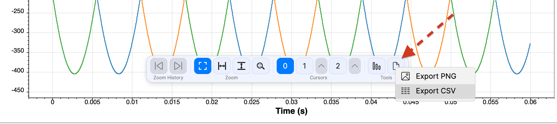
Legend: The chart toolbar Export menu provides direct access to Export PNG and Export CSV for sharing or reusing chart data.
From the Results toolbar, use Import CSV file to bring in external waveforms:
- Import CSV File (Single Time Column Format)
- Import CSV File (Multiple Time Column Format)
For a broader walkthrough of the import workflow, see Import an external .csv file.
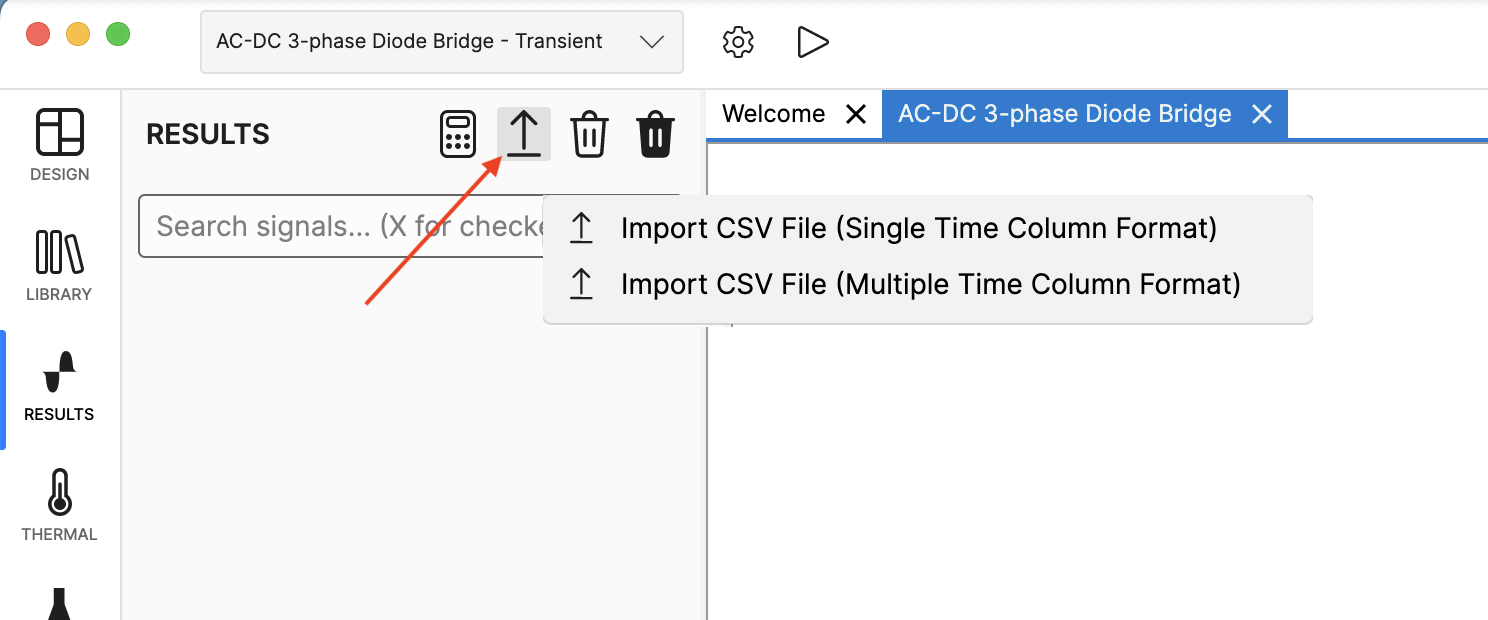
Legend: The Results toolbar menu shows the two CSV import options used to bring external waveform files into SIMBA charts.
Step 10 — Run a Discrete Fourier Transform (DFT)
If you need frequency-domain analysis, open the Discrete Fourier Transform tool from the chart toolbar.
You can work in two modes:
- Frequency Range
- Time Range
In Frequency Range mode:
- define the Main frequency
- choose the Analysed periods
- set the Number of harmonics
In Time Range mode:
- define Tmin
- define Tmax
- set the Number of harmonics
Then click Calculate DFT. SIMBA creates a DFT chart from the selected signals.

Step 11 — Control result retention with Job History Limit
When you run many simulations, the Results panel can accumulate many jobs. To keep the workspace manageable, open Settings and adjust Job History Limit.
This limits how many jobs remain in the Results panel automatically. However, some jobs are protected and are never removed automatically:
- Auto-Reload jobs
- Pinned jobs
- jobs that are currently in use by charts
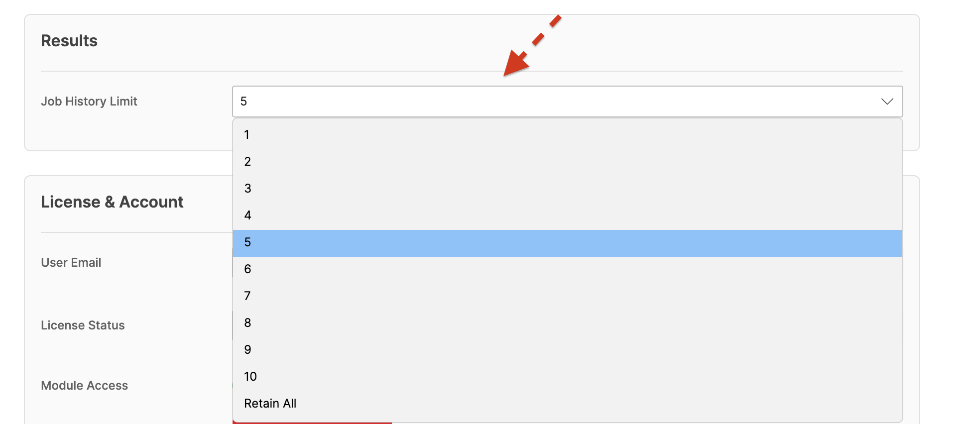
Legend: The Settings page highlights Job History Limit and clarifies that Auto-Reload, pinned, and in-use jobs are retained automatically.
Step 12 — Use Signal Calculator for advanced post-processing
For advanced post-processing, open Signal Calculator from the Results toolbar. It lets you create new waveforms from existing signals using mathematical expressions and built-in functions.
The calculated result appears as a new job in the Results panel. From there, you can:
- chart it,
- compare it with other runs,
- export it,
- or analyze it with DFT.

Next steps
- Create a chart from one signal, then add a second signal to compare them in the same plot.
- Try enabling Append Job Description to Signal Labels so the legend becomes more informative during comparisons.
- Use two cursors and inspect the Cursor Data tab to measure waveform differences.
- Export one chart to CSV and import an external CSV file to compare measurements from different sources.
If you want a broader introduction to the SIMBA workspace before working with results, see interface_project_navigation.md.